

Apex — Logo Design & Club Communications for Prior Lake Soccer Club
Apex is a concept created for Prior Lake Soccer Club, combining a custom logo with two informational posters designed to communicate the club's structure and player development journey. Inspired by the idea of reaching one's peak, the project blends athletic heritage with a clean and approachable visual language.
Working Process (Logotype First Options)
The design process explored different directions, including traditional sports badges, mountain-inspired symbols, and vintage athletic references. Through multiple iterations, the identity evolved into a distinctive and recognizable club mark.
The Result
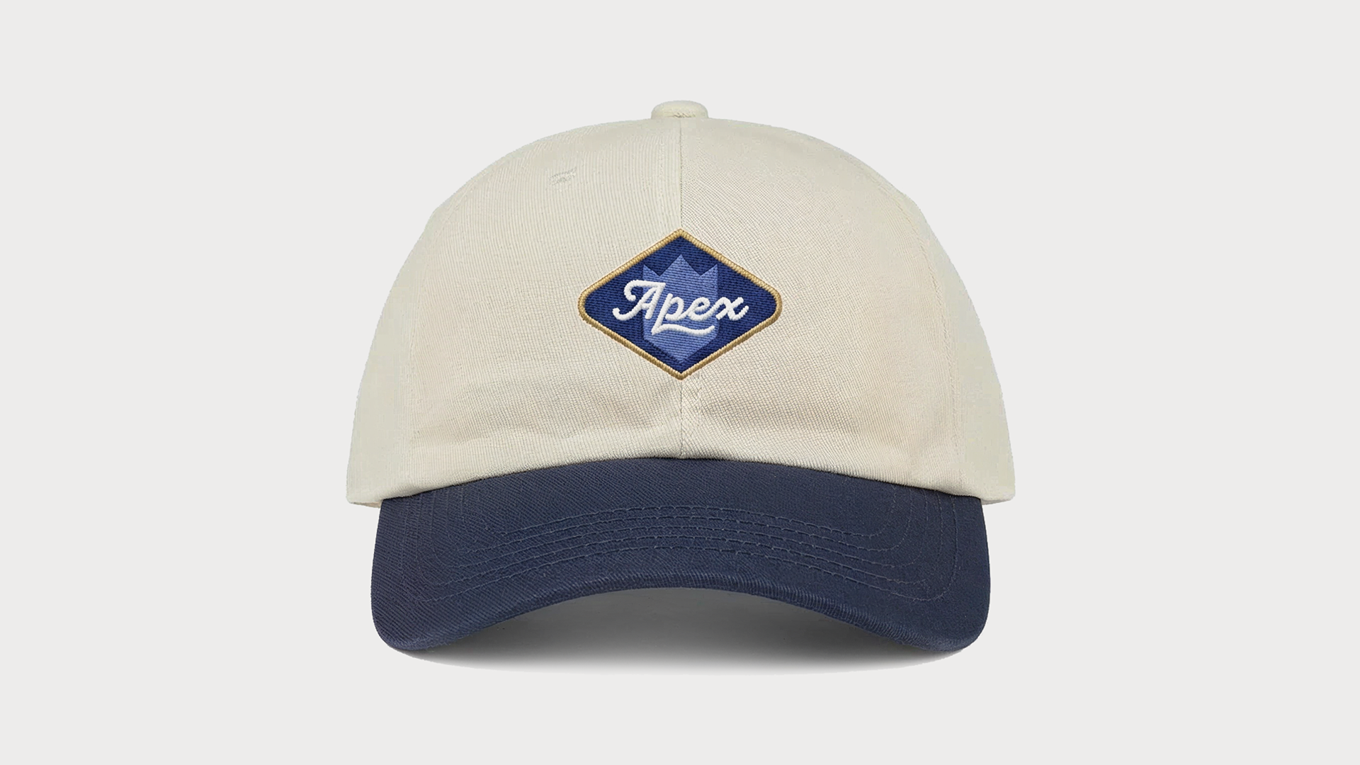
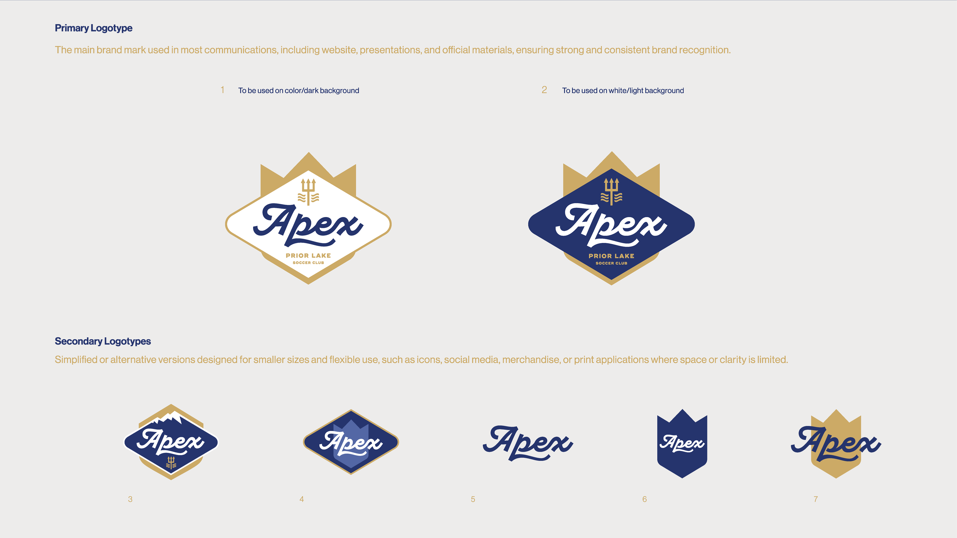
The final logo combines a custom script wordmark with a geometric emblem inspired by mountain peaks. Multiple logo variations were created to ensure flexibility across print, digital, and apparel applications.
The final logo combines a custom script wordmark with a geometric emblem inspired by mountain peaks. Multiple logo variations were created to ensure flexibility across print, digital, and apparel applications.
Apex is built around the idea of ambition, growth, and community. The name reflects the highest point of achievement, making it a natural fit for a youth soccer club focused on long-term player development.
Prior Lake Ecosystem and Player Pathway Infographic Posters
Two supporting posters were created to help communicate the club's programs. The Player Pathway outlines progression through age groups, while the Ecosystem poster provides a simplified overview of development opportunities available to players and their families.
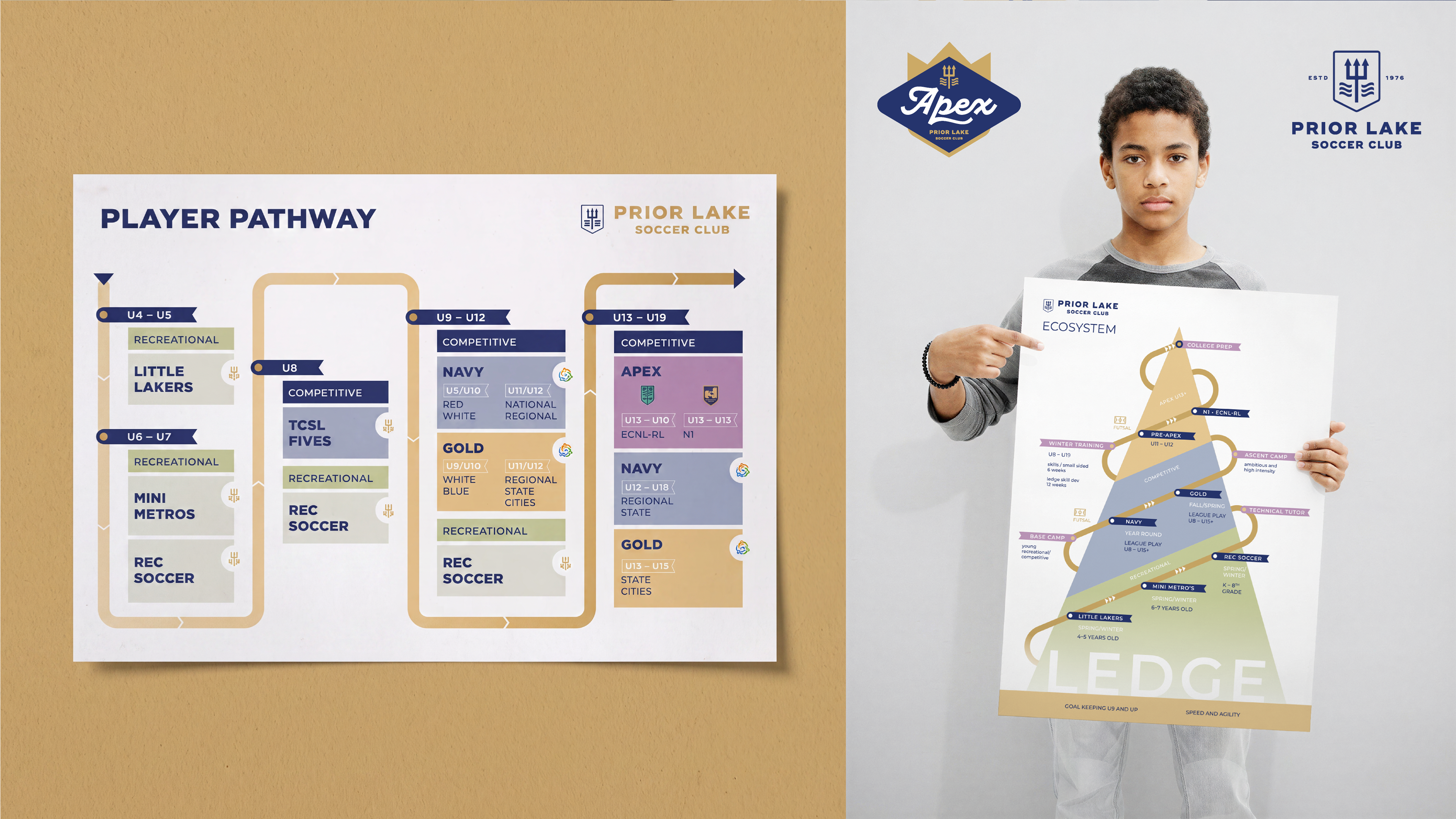
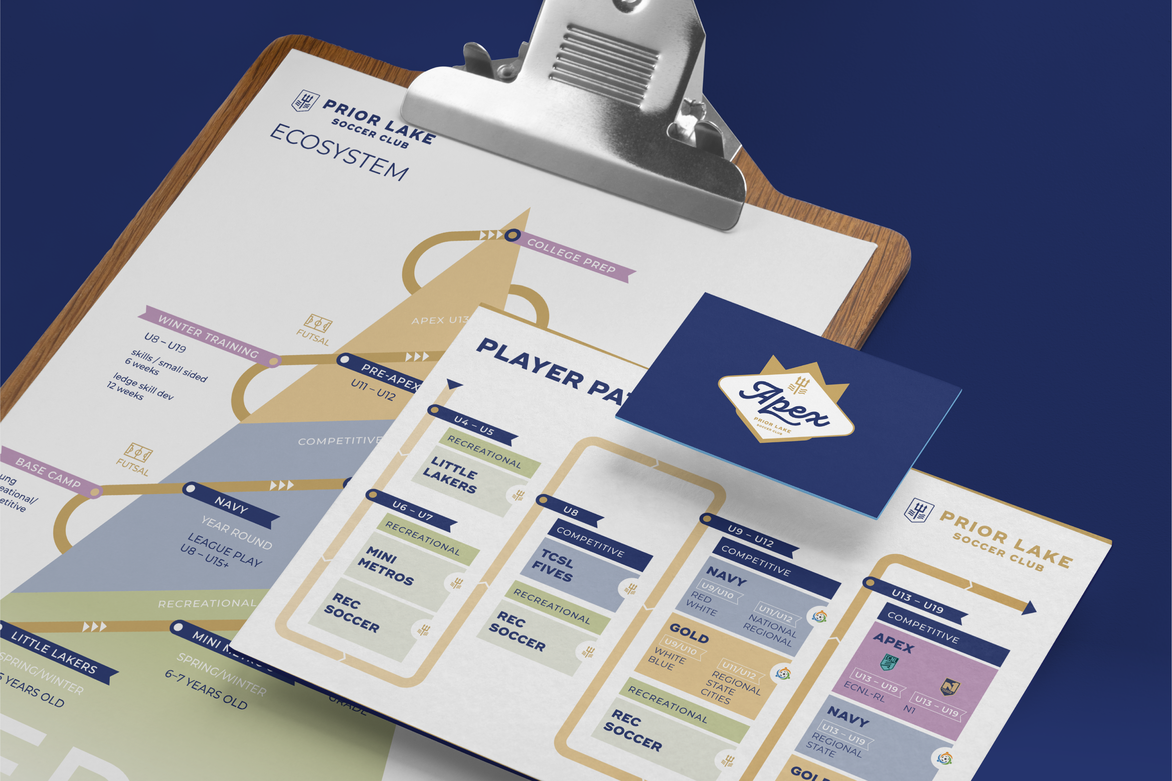
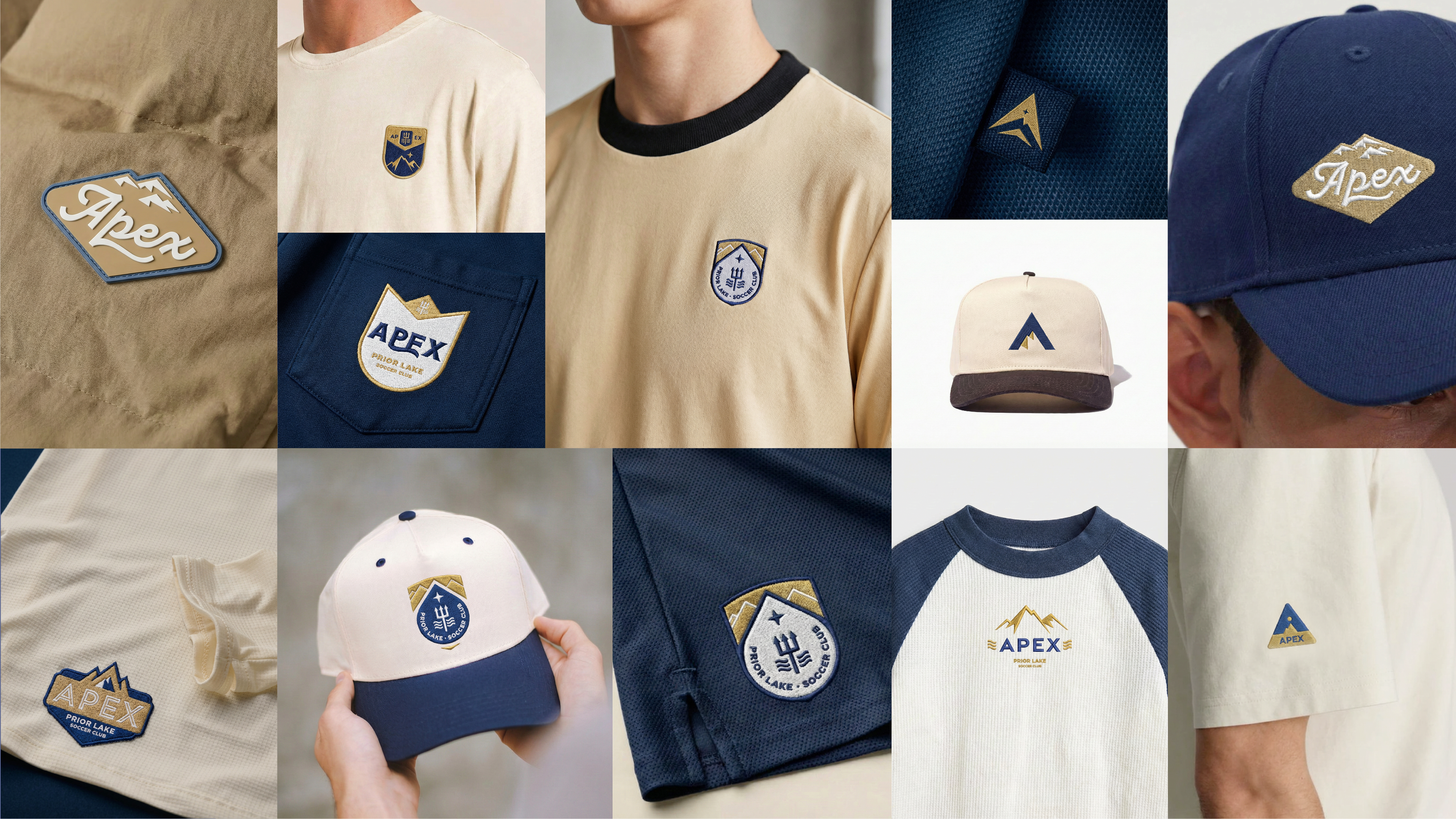
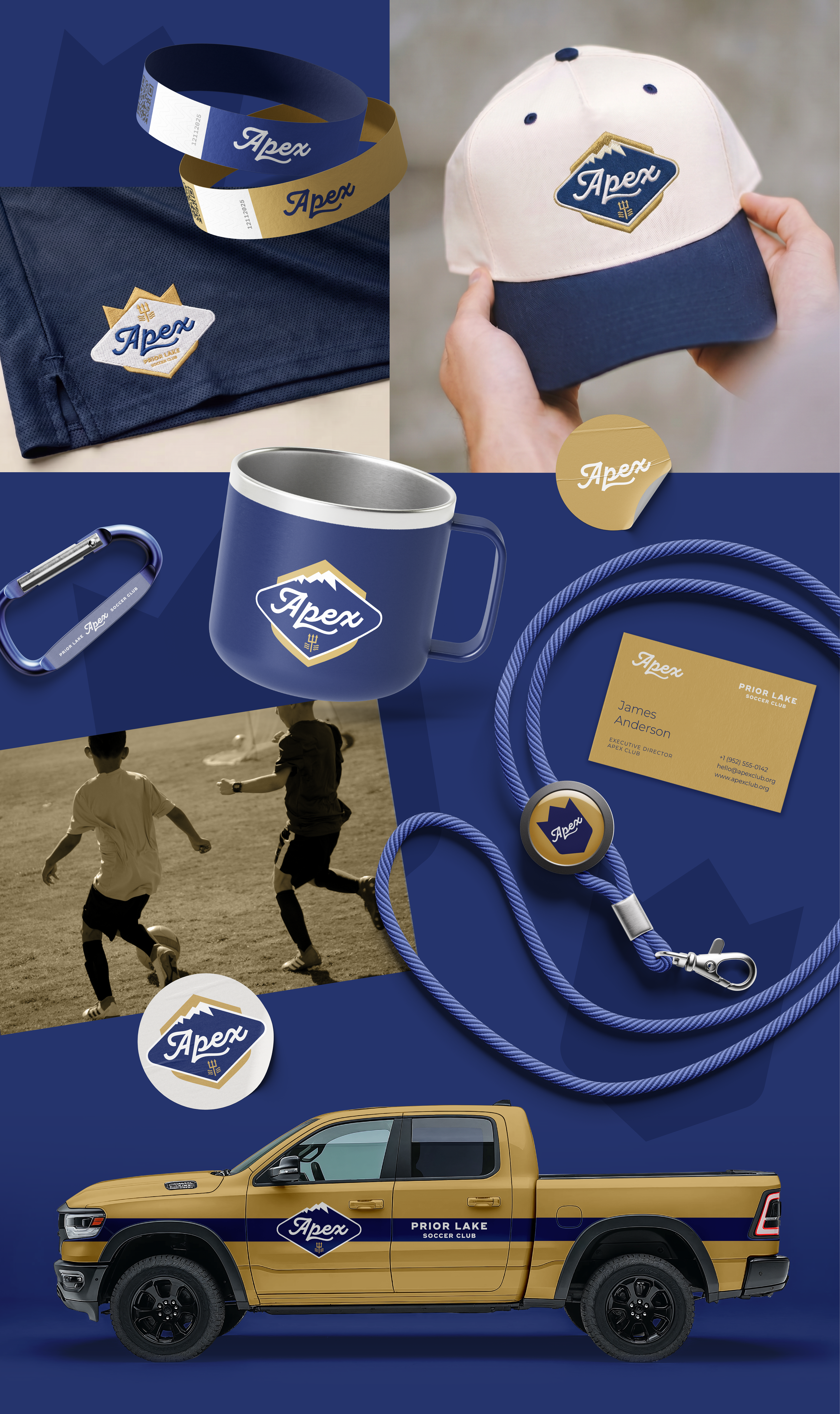
To demonstrate versatility, the logo was applied across a selection of merchandise and promotional materials, illustrating how the identity could extend into everyday club communications.
Logo design and communication materials created for Apex / Prior Lake Soccer Club.
Thanks for watching!